Creating HTML forms using KompoZer
Creating HTML forms using KompoZer
With the rise of the Internet, many activities have moved online. One common activity is filling out forms on web pages, which help us enter information about ourselves or a product. HTML forms make websites interactive and allow users to enter data easily. For example, when you want to create an email account or register on a website, you need to fill out a form with your personal details. This information is used to set up your account. The data you enter is stored by the application and helps in retrieving user details.
An HTML form is a container used to collect various kinds of inputs from the user. These forms can include labels, checkboxes, text input fields, radio buttons, submit buttons, reset buttons, and more. These elements help users enter and validate data within the forms.
Let's look at some of the key elements used to create HTML forms:
- Form: The main container for all form elements.
- INPUT: Used to create various types of input fields like text boxes, radio buttons, and checkboxes.
- Textarea: Used to create a larger text input field.
- Select and Option: Used to create drop-down menus. Next, we will create a simple form using these HTML tags. But first, let's discuss each of these elements in detail.
<form action="register.html" method="post">
<!-- input elements go here -->
</form>
In this example, the <form> element has two attributes: action and method.
- action: This attribute specifies where to send the form data when the form is submitted. The value is a filename (e.g., "register.html"), which is opened when the user clicks the submit button after filling out the form.
- method: This attribute specifies the HTTP method to use when sending the data. It can have two values: GET and POST.
- GET: This method appends the form data to the URL and sends it to the server. It has a limitation on the amount of data that can be sent.
- POST: This method sends the form data as a block within the body of the HTTP request, without any length restrictions. It is generally used for sending larger amounts of data securely.
By understanding these attributes, you can control how and where the data from your HTML forms is sent.
Input Elements
Input elements are used to insert various input fields like radio buttons, text boxes, and checkboxes into a form. The tag <input> is used to create these input elements. The <input> tag has different attributes like type, name, and value.
- type: Specifies the type of field to be created in the form.
- name: Specifies the name of the field in the form.
- value: Specifies the default value of the field in the form.Here’s a table showing different values for the type attribute and their usage:
Description
Example
Radio
Creates radio buttons. Only one radio button can be selected at a time from a group of radio buttons.
<input type="radio" name="var" value="txt">
Checkbox
Creates checkboxes. Multiple checkboxes can be selected at a time. Generally used for multiple selections.
<input type="checkbox" name="var" value="txt">
Text
Creates a text field for entering text. Users can enter any data of their choice
<input type="text" name="var" value="txt">
Password
Creates a password field. Similar to a text field, but the characters are hidden and/or unreadable as they are typed.
<input type="password" name="var">
Submit
Creates a submit button. Clicking this button submits the form data to the file specified in the action attribute of the <form> element.
<input type="submit" value="label">
Reset
Creates a reset button. Clicking this button clears the form and resets fields to their default values.
<input type="reset" value="label">
By using Radio, Checkbox, Text, Password, Submit and Reset input elements and their attributes, you can create interactive and functional forms on your web pages.
Textarea Element
The <textarea> element allows multi-line text input. It is used to enter a large amount of text, such as comments, reports, or product descriptions. The tag <textarea>...</textarea> is used to implement this element, and it allows users to enter an unlimited number of characters.
The size of a <textarea> element can be controlled using the rows and cols attributes:
- rows: Sets the number of visible text lines.
- cols: Sets the number of visible characters per line.
<form method="post" action="comment.html">
Input your comments: <br />
<textarea name="comment" rows="4" cols="20">...Your comments here…</textarea></form>
Select and Option Elements
The <select> element is used to create a drop-down list or menu in a form. The <option> element specifies the values that appear in the menu. The <select>...</select> tags are used to create the drop-down menu, and the <option>...</option> tags are used to create each item within the menu.
Here’s an example:
<select>
<option value="Ahmedabad">Ahmedabad</option></select>
<option value="Rajkot">Rajkot</option>
<option value="Surat">Surat</option>
Sample Registration Form
Using the elements we’ve discussed, let's create a sample registration form. Here’s the HTML code to generate the form:
<!DOCTYPE html>
<html>
<head>
<title>Registration Form</title>
</head>
<body>
<h2>Registration Form</h2>
<form method="post" action="register.html">
Name: <input type="text" name="name"><br><br>
Email: <input type="text" name="email"><br><br>
Password: <input type="password" name="password"><br><br>
Gender:
<input type="radio" name="gender" value="male"> Male
<input type="radio" name="gender" value="female"> Female<br><br>
Hobbies:
<input type="checkbox" name="hobbies" value="reading"> Reading
<input type="checkbox" name="hobbies" value="traveling"> Traveling<br><br>
City:
<select name="city">
<option value="Ahmedabad">Ahmedabad</option>
<option value="Rajkot">Rajkot</option>
<option value="Surat">Surat</option>
</select><br><br>
Comments: <br />
<textarea name="comments" rows="4" cols="20">...Your comments here…</textarea><br><br>
<input type="submit" value="Submit">
<input type="reset" value="Reset">
</form>
</body>
</html>
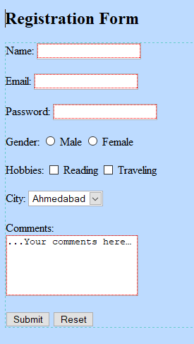
Figure 1.1
Using an IDE
Introduction to KompoZer
KompoZer is a free, open-source web development IDE that you can download from KompoZer.net. It provides a web page editor with a simple graphical interface known as WYSIWYG ("What You See Is What You Get"). It integrates web page development and web file management, making it quick and easy to create new web pages. Users can also edit web pages by modifying the source code. KompoZer includes a Site Manager for easy access to files on both local machines and remote servers and allows web pages and associated files to be uploaded to a remote server. KompoZer supports Cascading Style Sheets (CSS), which we'll learn about in the next chapter.
Understanding the KompoZer Interface
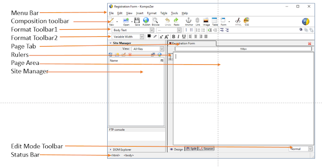
To open KompoZer, click its icon. a blank, untitled web page will open. If the different toolbars and status bar aren't visible, click on View > Show/Hide and select all options: Composition Toolbar, Format Toolbar 1, Format Toolbar 2, Edit Mode Toolbar, and Status Bar. Ensure the Site Manager and Rulers options are checked. The window will look like Figure 1.2.
In the centre of the window, you can see two panes: Site Manager and blank web page.
In Figure 1.2, you can see the menu bar at the top with options like File, Edit, View, Insert, Format, Table, Tools, and Help. Below the menu bar are three toolbars: Composition, Format Toolbar 1, and Format Toolbar 2.
Site Manager: A tool for navigating within a site or between sites. You can close it by clicking the close button or pressing F9.
Creating a New File
To create a new file in KompoZer:
Open KompoZer.
In the menu bar, click File > New.
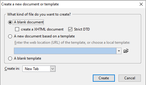
A dialog box titled "Create a new document or template" will appear (Figure 1.3).
Select the "Blank document" option.
In the "Create in" drop-down menu, select "New Tab" to create the page in a new tab.
Click the Create button
<!DOCTYPE html>
<html>
<head>
<title>Registration Form</title>
</head>
<body>
<h2>Registration Form</h2>
<form method="post" action="register.html">
Name: <input type="text" name="name"><br><br>
Email: <input type="text" name="email"><br><br>
Password: <input type="password" name="password"><br><br>
Gender:
<input type="radio" name="gender" value="male"> Male
<input type="radio" name="gender" value="female"> Female<br><br>
Hobbies:
<input type="checkbox" name="hobbies" value="reading"> Reading
<input type="checkbox" name="hobbies" value="traveling"> Traveling<br><br>
City:
<select name="city">
<option value="Ahmedabad">Ahmedabad</option>
<option value="Rajkot">Rajkot</option>
<option value="Surat">Surat</option>
</select><br><br>
Comments: <br />
<textarea name="comments" rows="4" cols="20">...Your comments here…</textarea><br><br>
<input type="submit" value="Submit">
<input type="reset" value="Reset">
</form>
</body>
</html>
Figure 1.1
Using an IDE
Creating a form using HTML tags can be tedious. A simpler method is to use an IDE (Integrated Development Environment). An IDE is a software application that provides complete facilities for developers, including a graphical user interface (GUI), a text or code editor, a compiler or interpreter, and a debugger. Examples of open-source IDEs include KompoZer, Eclipse, JBuilder, and NetBeans.
Next, let’s discuss how to use KompoZer to create web pages.
By understanding these elements and tools, you can create interactive and functional web forms more efficiently.
Introduction to KompoZer
KompoZer is a free, open-source web development IDE that you can download from KompoZer.net. It provides a web page editor with a simple graphical interface known as WYSIWYG ("What You See Is What You Get"). It integrates web page development and web file management, making it quick and easy to create new web pages. Users can also edit web pages by modifying the source code. KompoZer includes a Site Manager for easy access to files on both local machines and remote servers and allows web pages and associated files to be uploaded to a remote server. KompoZer supports Cascading Style Sheets (CSS), which we'll learn about in the next chapter.
Understanding the KompoZer Interface
To open KompoZer, click its icon. a blank, untitled web page will open. If the different toolbars and status bar aren't visible, click on View > Show/Hide and select all options: Composition Toolbar, Format Toolbar 1, Format Toolbar 2, Edit Mode Toolbar, and Status Bar. Ensure the Site Manager and Rulers options are checked. The window will look like Figure 1.2.
In the centre of the window, you can see two panes: Site Manager and blank web page.
In Figure 1.2, you can see the menu bar at the top with options like File, Edit, View, Insert, Format, Table, Tools, and Help. Below the menu bar are three toolbars: Composition, Format Toolbar 1, and Format Toolbar 2.
- Composition Toolbar: Used to create, open, save, or publish web pages.
- Format Toolbars 1 and 2: Used to format text, add bullets, numbering, and other formatting operations.
Site Manager: A tool for navigating within a site or between sites. You can close it by clicking the close button or pressing F9.
- Page Pane: Shows a blank, untitled web page.
- Normal View: Similar to Preview mode but with visible table outlines.
- HTML Tags View: Highlights HTML tags with a yellow marker for easy editing. This is helpful to those who are familiar with HTML.
- Preview Mode: Shows the page as it would appear in a browser, but scripts don't run and links don't work.
- Design Tab: Used to design the web page.
- Split Tab: Displays the HTML source of the current element.
- Source Tab: Shows all details of the HTML code, allowing for source code editing.
Creating a New File
To create a new file in KompoZer:
Open KompoZer.
In the menu bar, click File > New.
A dialog box titled "Create a new document or template" will appear (Figure 1.3).
Select the "Blank document" option.
In the "Create in" drop-down menu, select "New Tab" to create the page in a new tab.
Click the Create button
(Figure 1.3).
Opening an Existing File
To open an existing file:
Click the open file icon on the Composition Toolbar.
Alternatively, click File > Open.
If the file was opened recently, you can also access it from File > Recent Pages.
Creating a Form in KompoZer
Let's create a simple form with two input fields: Name and E-mail address, and a submit button.
Create a New Form
Open KompoZer and create a new file.
From the menu bar, select Insert > Form > Define Form. Alternatively, click the form icon in the Composition Toolbar. This opens the Form Properties dialog box Figure 1.4
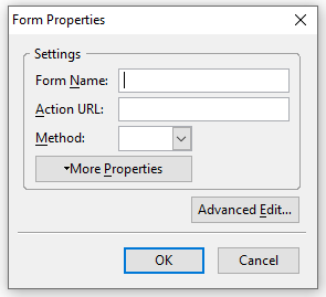
Figure 1.4
Enter a name for the form. In the Action URL, enter the file name where you want the form data to be submitted. Select the method POST from the drop-down menu, and click OK (Figure 1.5).
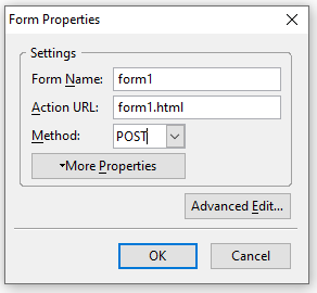
Figure 1.5
The form appears with a light blue outline (Figure 1.6). Press the Enter key a few times to create space in the form.
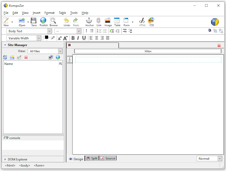
Figure 1.6
Adding Form Elements
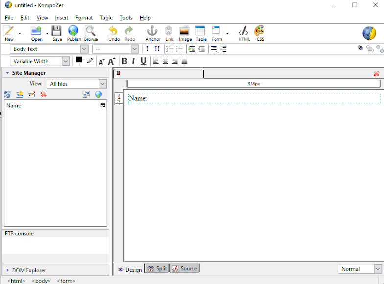
Name Field: Insert a label by clicking Insert > Form > Define Label. Type "Name" in the label field (Figure 1.7). Click outside the field to finish.
(Figure 1.7)
Insert an input text field by clicking Insert > Form > Form Field. Select "Text" from the drop-down menu (Figure 1.8).
Enter "name" in the Field Name text box and leave the Initial Value field empty. Click OK (Figure 1.9).
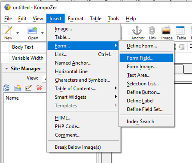
Figure 1.8
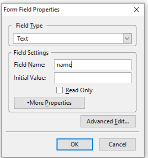
Figure 1.8
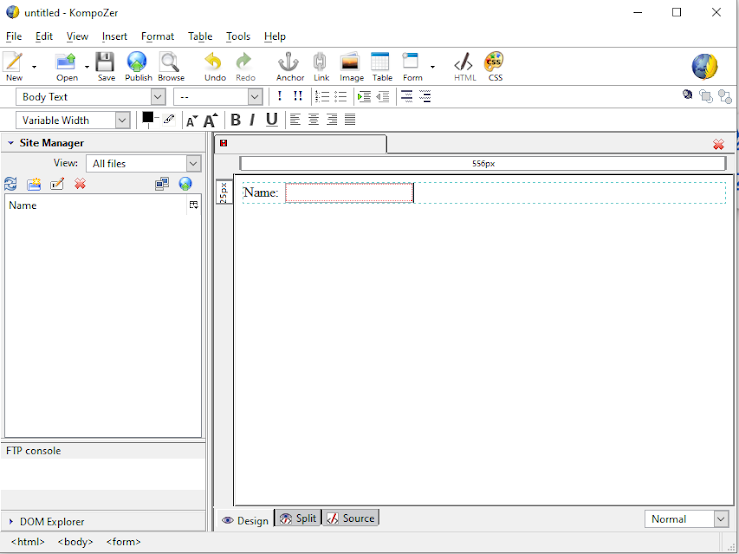
Figure 1.9
Opening an Existing File
To open an existing file:
Click the open file icon on the Composition Toolbar.
Alternatively, click File > Open.
If the file was opened recently, you can also access it from File > Recent Pages.
Creating a Form in KompoZer
Let's create a simple form with two input fields: Name and E-mail address, and a submit button.
Create a New Form
Open KompoZer and create a new file.
From the menu bar, select Insert > Form > Define Form. Alternatively, click the form icon in the Composition Toolbar. This opens the Form Properties dialog box Figure 1.4
Figure 1.4
Enter a name for the form. In the Action URL, enter the file name where you want the form data to be submitted. Select the method POST from the drop-down menu, and click OK (Figure 1.5).
Figure 1.5
The form appears with a light blue outline (Figure 1.6). Press the Enter key a few times to create space in the form.
Figure 1.6
Adding Form Elements
Name Field: Insert a label by clicking Insert > Form > Define Label. Type "Name" in the label field (Figure 1.7). Click outside the field to finish.
(Figure 1.7)
Insert an input text field by clicking Insert > Form > Form Field. Select "Text" from the drop-down menu (Figure 1.8).
Enter "name" in the Field Name text box and leave the Initial Value field empty. Click OK (Figure 1.9).
Figure 1.8
Figure 1.8
Figure 1.9
E-mail Field: Add another label "E-mail" and input text field as above. Enter "abc@xyz.com" in the Initial Value textbox to guide the user (Figure 1.10).
Figure 1.10
Submit Button: Insert a submit button by clicking Insert > Form > Form Field. Select "Submit Button" from the drop-down menu. Enter "Submit" in both Field Name and Field Value text boxes. Click OK (Figure 1.11).
Figure 1.11
Preview and Save
To preview the form, click the Edit mode toolbar and select Preview (Figure 1.12).
Figure 1.12
To see the source code, click the Source tab (Figure 1.13).
Figure 1.13
Save the file by clicking File > Save or the save button on the Composition Toolbar. Enter a title for the web page in the Page Title dialog box (Figure 1.14). Click OK.
Figure 1.14
A "Save Page As" dialog box appears. Enter a filename and location. Save the file with an .html or .htm extension (Figure 1.15).
Figure 1.15
Note: This page title dialog box will appear only for the first time when user save the web page.
Creating a Registration Form
Now, let's create the registration form we discussed earlier using KompoZer.
Create a New Form
Create a new file.
From the menu bar, select Insert > Form > Define Form. Enter the details as shown in Figure 1.16 and click OK. The form appears with a light blue outline. Press the Enter key to create space.
Figure 1.16
Figure 1.16
Add Heading to the form
Heading: Select Heading1 from Format Toolbar1 and center align from Format Toolbar2. Enter "Registration Form".
Adding Text Field
Name Fields: Insert labels and input fields for "First Name", "Middle Name", and "Last Name" as described earlier
Figure 1.17
The form will look like Figure 1.18.
Figure 1.18
Radio Buttons for Gender
Insert a label for "Gender".
Insert a radio button by clicking Form > Form Field and selecting "Radio Button" from the drop-down menu (Figure 1.19). Enter "gender" as the Group Name and "male" as the Field Value. Check "Initially Selected" if desired. Click OK.
Insert a label "Male" near the radio button.
Similarly, create another radio button with "gender" as the Group Name and "female" as the Field Value. Insert a label "Female" (Figure 1.20).
Note : While creating a radio button, the group name must be the same for all options.
Figure 1.19
Figure 1.20
Add Checkbox for Hobbies
Insert a label for "Hobby".
Insert a checkbox by clicking Form > Form Field and selecting "Check Box" from the drop-down menu (Figure 1.21). Enter a Field Name and Field Value. Check "Initially Checked" if desired. Click OK.
Insert a label "Singing" near the checkbox.
Similarly, create checkboxes for "Dancing" and "Reading". The form will look like
Figure 1.22.
Figure 1.21
Figure 1.22
Textarea for Address
Insert a label for "Address".
Insert a textarea by clicking Form > Text Area. Enter the Field Name and set the rows and columns (e.g., 4 rows and 60 columns). Enter initial text if desired. Click OK (Figure 1.23).
Figure 1.23
Dropdown for City
Insert a label for "City".
Insert a selection list by clicking Form > Selection List. Enter "city" as the List Name and add options (e.g., Ahmedabad, Baroda, Rajkot, Surat). Select "Initially Selected" for the default option. Click OK (Figure 1.24 & Figure 1.25).
Figure 1.24 & Figure 1.25
Submit and Reset Buttons
Insert a submit button by clicking Form > Form Field and selecting "Submit Button". Enter "Submit" in both Field Name and Field Value. Click OK.
Insert a reset button by selecting "Reset Button". Enter "Reset" in both Field Name and Field Value. Click OK. The form in normal view is shown in Figure 1.26.
Figure 1.26
Figure 1.26
Saving and Previewing
Before saving, give the page title as Registration Form as shown in Figure 1.27. Save the file as "example2.html". as shown in Figure 1.28
When we see this form on the browser this page title will be displayed on the title bar of the browser.
Figure 1.27
Figure 1.28
Note : If you are creating a website and this page is intended to be the home page that loads when you enter the website's URL, save the file with the name index.html.
Adding Background Color
To change the background color, go to Format > Page Colors and Background. Select "Use custom colors" and choose a background color from the dialog box (Figure 1.29). The form will look as Figure 1.30
Figure 1.29
Figure 1.30

0 Comments:
Post a Comment
Subscribe to Post Comments [Atom]
<< Home